

The lightning-card is a base Lightning Web Component that provides a visually consistent way to display content in a container with a header and body. It’s widely used in Salesforce to display information in an organized, card-like structure.
In this article, we’ll explore how to use the lightning-card, its properties, and examples to enhance your LWC projects.
Why Use Lightning Card?
The lightning-card component offers a simple, clean, and consistent design that aligns with the Salesforce Lightning Design System (SLDS). Key benefits include:
- Standardized UI – Consistent look and feel.
- Customizable Content – You can add any content inside the card body.
- Prebuilt Header – Easily add titles and icon assistance in the header.
- Responsiveness – Adapts well to different screen sizes.
Let’s have a look code examples now.
Basic Lightning Card
This is the simplest form of lightning-card with just a title and body content.
<template>
    <lightning-card title="Welcome">
      <p class="slds-p-around_medium">Welcome to Salesforce Verse!</p>
    </lightning-card>
</template>
Output:

Explanation:
title: Displays the card header text.- The body contains a simple paragraph with padding (
slds-p-around_medium).
Lightning Card with Custom Title
If you want to style or customize the title, you can leave the title attribute empty and add a custom title inside the div with slot attribute set to title.
<template>
    <lightning-card>
      <div slot="title">
        <h2 class="slds-text-heading_medium">Custom Card Title</h2>
      </div>
      <p class="slds-p-around_medium">This card has a custom title.</p>
    </lightning-card>
 </template>
Output:
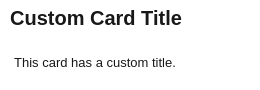
Using the slot="title" allows you to fully control how the title looks.
Lightning Card with Title and Icon
You can make the card more informative by adding an icon to the header.
<template>
  <lightning-card title="Account Info" icon-name="standard:account">
    <p class="slds-p-around_medium">Here is some account information.</p>
  </lightning-card>
</template>
Output:
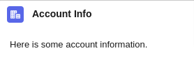
Explanation:
icon-name: Adds a standard Salesforce icon (in this case, an account icon) to the header.- Use SLDS icons like
standard:account,utility:settings, etc.
Lightning Card with Actions
Actions can be added to the card header using the slot="actions". This is useful for adding buttons, menus, or other interactive elements.
<template>
  <lightning-card title="Contact List" icon-name="standard:contact">
    <div slot="actions">
      <lightning-button label="Add Contact" variant="brand"></lightning-button>
    </div>
    <div class="slds-p-around_medium">
      <p>Here is the contact information.</p>
    </div>
  </lightning-card>
</template>
Output:

Explanation:
slot="actions": This slot allows you to place custom actions (like buttons or dropdowns) in the card header.lightning-button: Creates a “Add Contact” button with abrandvariant.
Lightning Card with Footer
Add a footer using the slot="footer" to display additional actions or information.
<template>
<lightning-card title="Contact List" icon-name="standard:contact">
    <div class="slds-p-around_medium">
        <table class="slds-table slds-table_bordered">
            <thead>
            <tr>
                <th scope="col">Name</th>
                <th scope="col">Email</th>
                <th scope="col">Phone</th>
            </tr>
            </thead>
            <tbody>
            <tr>
                <td>John Doe</td>
                <td>john.doe@example.com</td>
                <td>+1 123 456 7890</td>
            </tr>
            <tr>
                <td>Jane Smith</td>
                <td>jane.smith@example.com</td>
                <td>+1 987 654 3210</td>
            </tr>
            </tbody>
        </table>
        </div>
    <div slot="footer" class="slds-p-around_small slds-text-align_right">
    <lightning-button label="View All" variant="neutral"></lightning-button>
    </div>
</lightning-card>
</template>
Output:
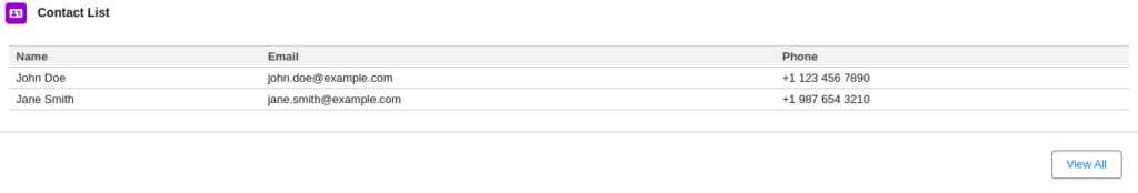
Use Case:
A footer is ideal for displaying action buttons like “View All” or status messages.
Lightning Card with SLDS Utility Classes
For more control over the design, use Salesforce Lightning Design System (SLDS) utility classes for padding, margins, and text alignment.
<template>
  <lightning-card title="Custom Styled Card">
    <div class="slds-text-align_center slds-p-around_medium">
      <p>This card has custom styling using SLDS classes.</p>
    </div>
  </lightning-card>
</template>
Output:

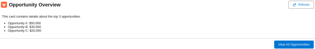
Complete Example
Below is a example code where we have created a UI using everything we have discussed so far. Have a look at the code and the output.
<template>
<lightning-card>
    <!-- Custom Header with Title and Icon -->
    <div slot="title" class="slds-grid slds-align_absolute-center">
    <lightning-icon icon-name="standard:opportunity" size="small" class="slds-m-right_x-small"></lightning-icon>
    <h2 class="slds-text-heading_medium">Opportunity Overview</h2>
    </div>

    <!-- Action Button in the Header -->
    <div slot="actions">
    <lightning-button label="Refresh" icon-name="utility:refresh" variant="neutral"></lightning-button>
    </div>

    <!-- Card Body with Styled Content -->
    <div class="slds-p-around_medium">
    <p class="slds-text-body_regular">
        This card contains details about the top 3 opportunities.
    </p>
    <ul class="slds-list_dotted slds-m-top_small">
        <li>Opportunity A: $50,000</li>
        <li>Opportunity B: $30,000</li>
        <li>Opportunity C: $20,000</li>
    </ul>
    </div>

    <!-- Footer with an Action Button -->
    <div slot="footer" class="slds-text-align_right">
    <lightning-button label="View All Opportunities" variant="brand"></lightning-button>
    </div>
</lightning-card>
</template>
Output:
Conclusion
The lightning-card is a powerful and versatile component for organizing and displaying information in Salesforce Lightning Web Components. By combining attributes like title, icon-name, slot="footer", and SLDS utility classes, you can create clean and professional UI elements that enhance user experience.
We hope now you have good understanding of how to use Lightning Card in developing Lightning Web Components. If you have any doubts then let us know in the comment box below.
2 thoughts on “Introduction to Lightning Card in Lightning Web Components (LWC)”