

In Lightning Web Components (LWC), reusability is a key principle. Instead of writing separate CSS for each component, we can use a shared CSS file to maintain a consistent design and reduce redundant code. In this article, we’ll explore how two LWC components use a shared CSS file for styling.
Let’s first have a look at the HTML and CSS code of both the Lightning Web Components.
Component One
<!-- componentOne.html -->
<template>
    <div class="my-container">  <!-- Styled container -->
        <button class="my-button">Click Me - One</button>  <!-- Styled button -->
    </div>
</template>
@import 'c/sharedCssLibrary'; /* Importing shared CSS file */

:host {
    display: block; /* Ensures the component takes up full width */
}
Component Two
<!-- componentTwo.html -->
<template>
    <div class="my-container">  <!-- Styled container -->
        <button class="my-button">Click Me - Two</button>  <!-- Styled button -->
    </div>
</template>
@import 'c/sharedCssLibrary'; /* Importing shared CSS file */

:host {
    display: block; /* Ensures the component takes up full width */
}
As you can see in both the Lightning Web Components we have created a styled container with a button inside it. Instead of defining styles in separate CSS files for both the components we have imported styles from a shared CSS file named sharedCssLibrary.css.
Have a look at the styling defined in the sharedCssLibrary.
.my-button {
    background-color: #0070d2; /* Salesforce blue */
    color: white; /* White text */
    padding: 10px 20px; /* Padding around text */
    border-radius: 5px; /* Rounded corners */
    border: none; /* No border */
    cursor: pointer; /* Pointer cursor on hover */
}

.my-container {
    border: 2px solid #0070d2; /* Blue border */
    padding: 15px; /* Padding inside the container */
    border-radius: 10px; /* Rounded container */
}
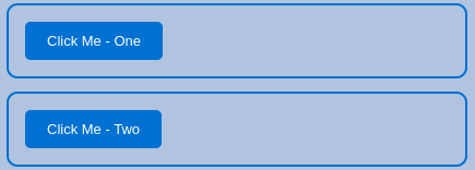
Here is how the LWC component looks.
As a best practices, instead of duplicating CSS in multiple files, we can define common styles in a single shared CSS file and apply them across multiple LWC components. This approach ensures a consistent design, simplifies maintenance, and keeps the codebase cleaner.
Benefits of Using Shared CSS
- Consistency: Ensures that styling remains uniform across components.
- Code Reusability: Reduces redundant CSS code.
- Easier Maintenance: Changes in the shared CSS reflect across all components instantly.
Conclusion
Using a shared CSS file in LWC is a best practice for maintaining a clean and scalable component architecture. This approach helps in achieving design consistency while reducing repetitive code. By leveraging shared styles, developers can efficiently manage styling across multiple components in a Salesforce application.
We hope you find this article helpful, if you have any questions then let us know in the comments below.
Learn how to use LWC in visualforce page?
Checkout this course to get started with LWC
Thanks Shubham, we were looking around for this solution. Much needed. Thank you!
Glad it helped.