
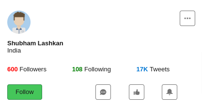
In this article I will give you the code to create the Below Profile Card Component using Lightning Web Component and Lightning Design System.
Code Snippet
Below is the LWC Component HTML code.
<template>
    <lightning-card>
        <div class="slds-m-around_medium">
            <div class="slds-grid">
                <div class="slds-col">
                    <lightning-avatar variant="circle" size="large"   src="https://www.lightningdesignsystem.com/assets/images/avatar1.jpg" initials="SL" fallback-icon-name="standard:avatar" alternative-text="Shubham Lashkan"  ></lightning-avatar>
                    <div class="slds-m-top_small Name">Shubham Lashkan</div>
                    <div class="Country">India</div>
                </div>
                <div class="slds-col">
                    <lightning-button-icon icon-name="utility:threedots"  alternative-text="threedots" title="threedots" class="slds-float_right"></lightning-button-icon>
                </div>
            </div>

                <div class="slds-grid slds-m-top_large">
                    <div class="slds-col">
                    <span  class="followers Name">600 </span><span>Followers</span>
                    </div>
                    <div class="slds-col">
                    <span class="following Name">108 </span><span >Following</span>
                    </div>
                    <div class="slds-col">
                    <span class="tweets Name">17K </span><span >Tweets</span>
                    </div>
                    </div>


                    <div class="slds-grid slds-m-top_large">
                        <div class="slds-col">
                            <lightning-button variant="success" label="Follow" title="Follow" ></lightning-button>

                        </div>
                        <div class="slds-col">
                        <div class="slds-grid">
                            <div class="slds-col">
                                <lightning-button-icon icon-name="utility:chat"  alternative-text="chat" title="chat"></lightning-button-icon>
                            </div>
                            <div class="slds-col">
                                <lightning-button-icon icon-name="utility:like"  alternative-text="like" title="like"></lightning-button-icon>
                            </div>
                            <div class="slds-col">
                                <lightning-button-icon icon-name="utility:notification"  alternative-text="notification" title="notification"></lightning-button-icon>
                            </div>
                        </div>
                        </div>

                        </div>
        </div>

    </lightning-card>
</template>
Below is the LWC Component CSS Code.
.Name
{
    font-weight: var(--lwc-fontWeightBold);
}
.country
{
    color: rgb(156 163 175);
}
.followers
{
    color:red;
}
.following
{
    color:green;
}
.tweets
{
    color:var(--lwc-brandAccessible);
}
I hope this code example helps you in developing the required profile card component. Share with us what you have developed using LWC and SLDS.